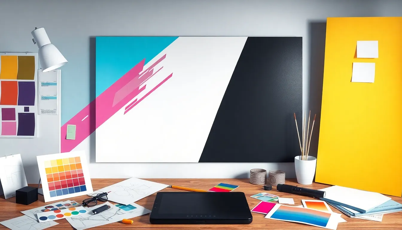
In the world of graphic design, emphasis is like the secret sauce that transforms a bland dish into a gourmet meal. It’s that magical element that grabs attention and makes viewers say, “Wow, I need to look at this!” Without it, designs can end up feeling as flat as a pancake on a Sunday morning.
Table of Contents
ToggleEmphasis In Graphic Design
Emphasis serves as a crucial element in graphic design, guiding viewers’ focus and enhancing overall composition. Utilizing various design techniques allows artists to create striking visual hierarchies that effectively convey messages.
Definition of Emphasis
Emphasis in graphic design refers to techniques that draw attention to specific elements within a composition. Designers use size, color, contrast, and placement to create focal points that guide the viewer’s gaze. For example, a larger font may highlight a key message, while a vibrant color can draw attention to a critical image. These methods effectively create a sense of hierarchy, making vital information stand out within the overall design.
Importance of Emphasis
Emphasis enhances visual communication by ensuring that important information captures the viewer’s attention. It prevents designs from becoming monotonous or chaotic by creating clear visual pathways. Designers improve user experience and engagement when they apply emphasis thoughtfully. A well-emphasized element increases retention and understanding, keeping audiences interested. Studies indicate that viewers quickly remember emphasized information, significantly aiding brand recognition and message clarity.
Techniques to Create Emphasis

Several techniques effectively create emphasis in graphic design. These methods guide viewers’ attention toward key elements, enhancing the overall composition.
Contrast
Contrast highlights specific design elements by juxtaposing differences. Using light against dark colors creates striking visuals; this draws attention and can emphasize important information. Additionally, contrasting shapes and textures can enhance depth in a design, making focal points stand out more. For instance, placing a bold font against a muted background increases legibility. Designers often use contrast as a tool to separate elements, ensuring clarity and focus in the intended message.
Color
Color serves as a powerful tool for creating emphasis. Bright or saturated hues catch the eye, making them ideal for highlighting essential components. For example, a red call-to-action button can drive user interaction more effectively than a gray one. Varying color schemes can help establish a visual hierarchy, guiding viewers toward primary and secondary messages. Additionally, harmonious color palettes enhance the aesthetic appeal while maintaining focus on key areas. Overall, utilizing color strategically captivates viewers and strengthens communication.
Size and Scale
Size and scale provide immediate emphasis in graphic design. Larger elements naturally attract more attention, making them ideal for headlines or critical information. Designers can utilize different sizes to create visual hierarchy, leading the viewer’s eye through the composition. Incorporating a mix of small and large graphic elements also adds interest; various scales can convey relationships between elements. For example, an oversized image next to smaller text creates contrast while highlighting the image’s importance. Emphasizing size and scale ensures the audience understands the significance of each element.
Utilizing Emphasis in Layout Design
Emphasis in layout design establishes a clear visual hierarchy, guiding viewers through content with intention and purpose. Designers prioritize key elements to ensure effective communication.
Hierarchical Structures
Hierarchical structures organize information in a way that allows viewers to prioritize what to see first. This method enhances clarity, as larger text or bolder images often represent the most important concepts. Designers can use varying font sizes, styles, and weights to create distinct levels of importance. Placing critical elements at the top or center attracts immediate attention. Consistent spacing reinforces the structure, allowing viewers to navigate content more efficiently. Effective hierarchies lead to organized layouts that communicate messages quickly and clearly.
Focal Points
Focal points draw attention to specific areas within a design, guiding the viewer’s gaze where it matters most. Utilizing contrasting colors, intricate details, or unique shapes highlights these areas clearly. Designers can also employ techniques like white space to separate focal points from surrounding elements, enhancing their visibility. Positioning significant items strategically ensures they become visual anchors within the design. Implementing focal points fosters a memorable user experience, creating lasting impressions that resonate with the audience.
Common Mistakes in Emphasis
Common mistakes in graphic design can undermine the effectiveness of emphasis. Designers often overlook these pitfalls, leading to less impactful compositions.
Overemphasis
Overemphasis occurs when too many elements compete for attention. This creates confusion rather than clarity. A cluttered design distracts viewers instead of guiding them to key information. Effective emphasis relies on simplicity and strategic placement. Focusing on one or two prominent elements allows for stronger communication. Balancing attention among elements enhances overall impact, ensuring designs convey messages without overwhelming the viewer.
Inconsistent Design Elements
Inconsistent design elements can disrupt the visual flow of a composition. Using varying styles, colors, or fonts muddles the message. Cohesion is essential for effective emphasis in design. All components should align with the overall theme to maintain visual harmony. Consistent use of colors and typography allows key features to stand out naturally. A unified design strengthens brand recognition and keeps viewer engagement high, ensuring that emphasis serves its intended purpose.
Conclusion
Emphasis is a fundamental aspect of graphic design that transforms ordinary visuals into compelling narratives. By strategically guiding viewers’ attention through techniques like contrast and size, designers can create meaningful connections between elements. This not only enhances the aesthetic appeal but also ensures that key messages resonate with the audience.
The careful application of emphasis fosters clarity and engagement while reinforcing brand identity. As designers hone their skills in creating focal points and maintaining visual harmony, they elevate their work beyond mere decoration. Ultimately, mastering emphasis is essential for effective communication in the ever-evolving landscape of graphic design.
