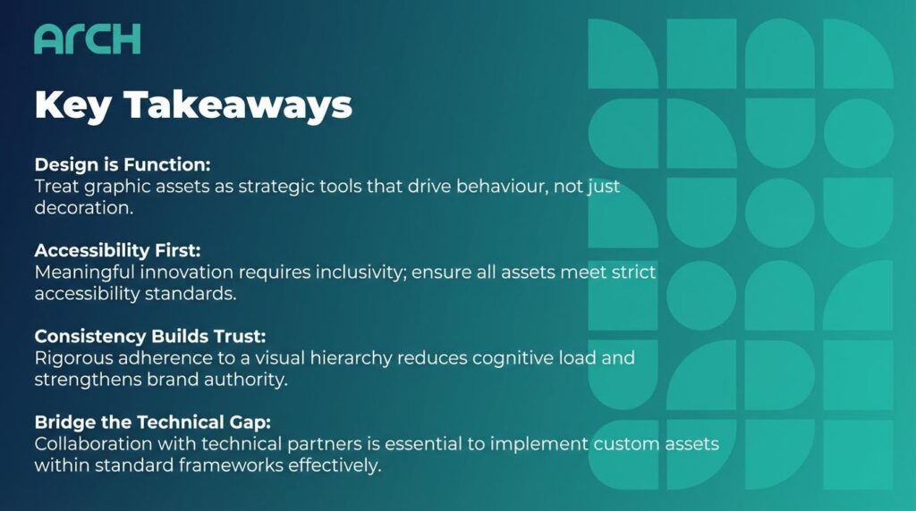
Key Takeaways
Design is Function: Treat graphic assets as strategic tools that drive behaviour, not just decoration.
Accessibility First: meaningful innovation requires inclusivity; ensure all assets meet strict accessibility standards.
Consistency Builds Trust: rigorous adherence to a visual hierarchy reduces cognitive load and strengthens brand authority.
Bridge the Technical Gap: collaboration with technical partners is essential to implement custom assets within standard frameworks effectively.
Psychology Matters: select shapes and colours based on the emotional response required to facilitate the user’s journey.
Redefining Design as a Strategic Asset
In the current B2B landscape, design is frequently misunderstood as a final coat of paint applied shortly before launch. However, for impact-driven brands, graphic assets are not merely decorative elements; they are functional tools that facilitate understanding and drive user behaviour.
True innovation requires shifting the narrative from “how it looks” to “what it does”. When we treat design elements as strategic assets, we move beyond subjective aesthetics. We begin to build a visual language that serves a clear, measurable purpose.
This approach bridges the critical gap between utility-focussed templates—which prioritise speed and function—and high-level strategic design that communicates brand values. The goal is to create a digital environment where every icon, typeface, and colour choice contributes to a cohesive, human-centred experience.
Selecting Assets for Impact, Not Just Utility
The selection of design assets must be intentional. Using stock libraries or default template assets often dilutes a brand’s message, rendering it indistinguishable from competitors. To drive tangible innovation, one must curate assets that resonate on a psychological level.
Prioritising Accessibility as a Core Value
Accessibility should never be an afterthought. Purpose-driven design starts with the premise that digital products must be usable by everyone. This means selecting colour palettes with sufficient contrast ratios and typefaces that remain legible across various devices and screen sizes.
When an asset is accessible, it signals to the user that the brand values inclusivity. This builds immediate trust. An impact-driven brand demonstrates its commitment to the user not just through mission statements, but through the granular details of its interface design.
The Psychology of Shape and Colour
Visual assets trigger immediate emotional responses. Rounded corners and soft palettes often evoke a sense of safety and collaboration, while sharp angles and high-contrast schemes suggest precision and urgency.
When selecting assets, analyse the emotional outcome you wish to provoke. If your platform facilitates complex financial decisions, stability is key; therefore, grounded, symmetrical assets are preferable to abstract, chaotic forms. Every pixel must work to reduce cognitive load and guide the user toward their goal.
Bridging the Gap: From Templates to Custom Innovation
Templates are an excellent starting point for efficiency, yet they rarely carry the nuance required for high-level brand storytelling. The challenge lies in customising these utility-focussed frameworks to reflect a unique, purpose-driven identity.
Customising the User Journey
To elevate a standard template, focus on key interaction points. Replace generic buttons with custom assets that provide clear feedback states (hover, active, disabled). These micro-interactions are where the brand personality shines through.
It is vital to ensure that these customisations do not break the underlying utility of the framework. This is where technical expertise becomes invaluable. Collaborating with experienced website and app developers– such as Arch- allows marketing teams to implement bespoke design assets without compromising the platform’s performance or code integrity.
Consistent Iconography and Visual Hierarchy
Inconsistency breeds confusion. A common pitfall in hybridising templates with custom design is a mismatched visual language—thin-line icons mixed with filled shapes, or clashing illustrative styles.
Establish a strict visual hierarchy. Ensure all iconography shares the same stroke width, corner radius, and perspective. This rigour transforms a disjointed collection of features into a polished, professional product that commands authority.
Implementing a Human-Centred Framework
Ultimately, purpose-driven design is about empathy. It involves anticipating the user’s needs and meeting them with clarity and elegance. By meticulously selecting assets that align with your brand’s mission, you turn abstract values into tangible digital experiences.
Organisations must audit their current design libraries. Ask if each asset serves a distinct purpose. If an element exists solely for aesthetic flair without contributing to the user journey, it is likely superfluous.
Conclusion
Leveraging purpose-driven design assets is not about reinventing the wheel; it is about refining it to roll smoother and faster. By moving beyond the aesthetic and focusing on the strategic application of visual elements, businesses can drive tangible innovation.
This approach transforms the user interface from a static display into a dynamic conversation. It requires a commitment to accessibility, psychological insight, and technical collaboration. When executed correctly, the result is a digital product that is not only beautiful but profoundly impactful.
About the Author
Hamish Kerry is the Marketing Manager at Arch, where he’s spent the past six years shaping how digital products are positioned, launched, and understood. With over eight years in the tech industry, Hamish brings a deep understanding of accessible design and user-centred development.
Frequently Asked Questions
1. What is the difference between aesthetic design and purpose-driven design? Aesthetic design focuses primarily on the visual appeal and beauty of an asset. Purpose-driven design prioritises the function, accessibility, and strategic goal of the asset, ensuring it solves a user problem or communicates a specific value.
2. Can templates truly support high-level innovation? Yes, but only if they are customised strategically. Templates provide a structural foundation, but the innovation comes from tailoring the visual assets and interactions to meet specific user needs and brand goals.
3. Why is accessibility considered a design asset? Accessibility expands your market reach and improves the user experience for everyone, not just those with disabilities. It is a strategic asset that enhances usability, boosts SEO, and demonstrates corporate social responsibility.
Sources
McKinsey & Company: The Business Value of Design
Forrester: The ROI of User Experience