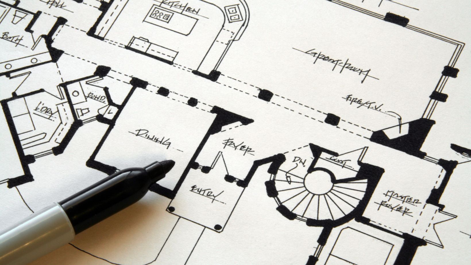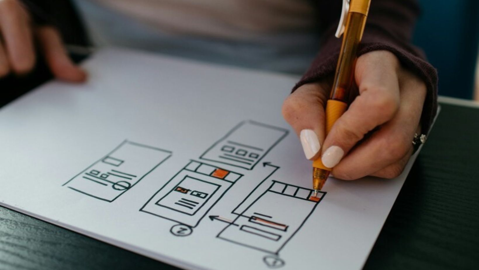
One of the biggest defining features that separates the design world from the general art world is the practical aspect. In the modern digital world, the most common type of practical design is in UI, or user interface, whether that’s for websites or apps or anything else. UI design is a skillset all to itself, and for those not familiar with how different it can be, here are just a few examples of how.
Table of Contents
ToggleGoal Oriented
Behind any good app or website, there should always be a very clear stated goal. In most commercial cases, this is usually about funnelling users towards some kind of selling point, ideally one that can be controlled by the company. The UI should be designed in tandem with the UX, or user experience, meaning that customers are naturally guided towards certain products.

Say that, for example, the client is a telecom company and is currently looking to promote a new high-speed internet service over their slower options. Any customer who comes to their website should see this product highlighted visually near all internet references, with prominent links to the core page and lack of emphasis on any other offerings.
Fitting The Tech
Regardless of the exact platform you’re making it for, designing a UI means that you’re working in a medium with extensive technical restrictions and needs. Apps have interactive features that require not just static designs but animations that work in tandem with programming, and websites have certain size and functionality limitations for things like buttons, fonts and integrated plug-ins.
For instance, if you’re building a UI for an online casino site, getting the colours and layouts arranged is just the first step. Casinos regularly have multiple promotions at once that are both active and in need of pushing to customers. Something like a casino rewards bonus not only needs a clear and distinct page but will also require pop-ups and notifications tied back to that page, all of which must have a cohesive design.
Keep It Simple
Only after everything else is in place can you start looking at embellishments to the overall design, but remember that ‘less is more’ is a key concept at play. Many novice UI designers will take the approach of adding as many fancy features in as possible, but what they end up doing is undermining the UX in the process.

Put simply, too many moving parts on an app or website is going to distract the user and inevitably pull them away from whatever you actually want them to see. Having all of your buttons with different colorations across your app may look visually interesting, but your customers are going to take that little bit longer to know where to tap or click. If we know anything for sure about UX, it’s that more time is usually less conversions, so keeping it as clear and streamlined as possible is key.
Keep in mind that no UI design can ever be considered ‘perfect’. It’s all about adapting and adjusting to match the current trends, so don’t worry if you don’t get it spot-on the first time out.


