
When it comes to web design, one crucial aspect that often gets overlooked is color theory. Choosing the right color palette can significantly impact the overall user experience and visual appeal of a website. As an expert in the field, I understand the importance of finding the perfect balance between aesthetics and functionality.
Research has shown that approximately 85% of consumers base their purchasing decisions on color alone. This staggering statistic highlights just how influential colors can be in shaping our perceptions and emotions. Design companies in LA, known for their cutting-edge creativity, understand this concept all too well.
In today’s competitive digital landscape, standing out from the crowd is essential. By carefully selecting a color scheme that aligns with your brand identity and target audience, you can create a visually captivating website that leaves a lasting impression. Design companies in LA leverage their expertise to craft unique palettes that not only resonate with users but also reflect the essence of their clients’ brands.
In conclusion, understanding color theory and choosing the right palette is vital in web design. With 85% of consumers placing importance on colors when making purchasing decisions, it’s clear that colors have a significant impact on user perception. Design companies in LA play a crucial role in creating visually stunning websites by leveraging their knowledge of color psychology and design principles. Understanding Color Theory
Color theory is a fundamental aspect of web design, with the ability to greatly impact the overall look and feel of a website. By understanding color theory, designers can create visually appealing and harmonious palettes that effectively communicate the desired message to users.
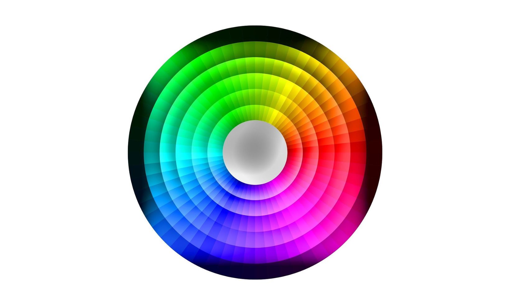
One key concept in color theory is the color wheel. The color wheel consists of primary colors (red, blue, and yellow), secondary colors (orange, green, and purple), and tertiary colors (a combination of primary and secondary colors). This tool helps designers identify relationships between colors and choose complementary or contrasting hues for their designs.
Another important consideration in color theory is color psychology. Colors have the power to evoke certain emotions or convey specific messages. For example, warm tones like red and orange are often associated with energy and excitement, while cool tones like blue and green can create a sense of calmness or tranquility.
When selecting a color palette for a website, it’s crucial to consider the target audience. Research has shown that around 85% of consumers prioritize visual appearance over other factors when visiting websites. Therefore, design companies in LA must carefully select colors that resonate with their target demographic.
In addition to considering aesthetics and psychology, accessibility should also be taken into account. Designers need to ensure that their chosen palette meets accessibility guidelines by providing sufficient contrast between text and background colors. This ensures that all users can easily read content regardless of any visual impairments they may have.
To summarize, understanding color theory is essential for creating visually appealing web designs that effectively communicate with users. By utilizing concepts such as the color wheel, considering psychological effects of different hues, catering to target audiences’ preferences, and ensuring accessibility guidelines are met, design companies in LA can craft stunning websites that leave a lasting impression on visitors Choosing the right color palette is of utmost importance when it comes to web design. The colors we choose have a significant impact on how users perceive and interact with a website. In fact, studies have shown that up to 85% of visitors are influenced by the colors used in a website’s design. As a result, it is crucial for design company in LA (and everywhere else) to understand and utilize color theory effectively.
One reason why selecting the right palette is essential is because colors evoke emotions and convey messages. Different colors have different psychological effects on people. For example, warm tones like red and orange can create feelings of excitement or urgency, while cool tones like blue and green can evoke calmness or trust. By understanding the psychology behind colors, designers can strategically use them to elicit specific responses from users.
In addition, choosing a harmonious color scheme enhances the overall aesthetic appeal of a website. When complementary or analogous colors are used together, they create visual harmony and balance. This visually pleasing experience can greatly improve user engagement and make visitors more likely to stay on the site longer.

Moreover, an appropriate color palette helps establish brand identity and recognition. Consistently using specific colors throughout a website not only makes it easier for users to associate those colors with your brand but also helps in building brand recognition over time.
Furthermore, accessibility should be taken into consideration when choosing a color palette for web design. It’s important to ensure that text is easily readable against background colors for all users, including those with visual impairments or color blindness.
By carefully selecting the right color palette based on these considerations, design companies in LA (and beyond) can create visually appealing websites that effectively communicate their clients’ messages while engaging users in meaningful ways. So next time you embark on a web design project, remember the significance of choosing the right color palette – it’s not just about aesthetics but also about creating an impactful user experience.