Creating a font in Illustrator is an exciting and creative endeavor that allows you to personalize your designs and add a unique touch to your projects. With the right tools and techniques, you can bring your own typeface to life. In this article, I’ll guide you through the step-by-step process of creating a font using Adobe Illustrator.
Firstly, it’s important to have a clear vision of the style and characteristics you want for your font. This will help guide your design decisions throughout the process. Whether you’re aiming for a bold and modern look or something more elegant and handwritten, defining your desired aesthetic is crucial.
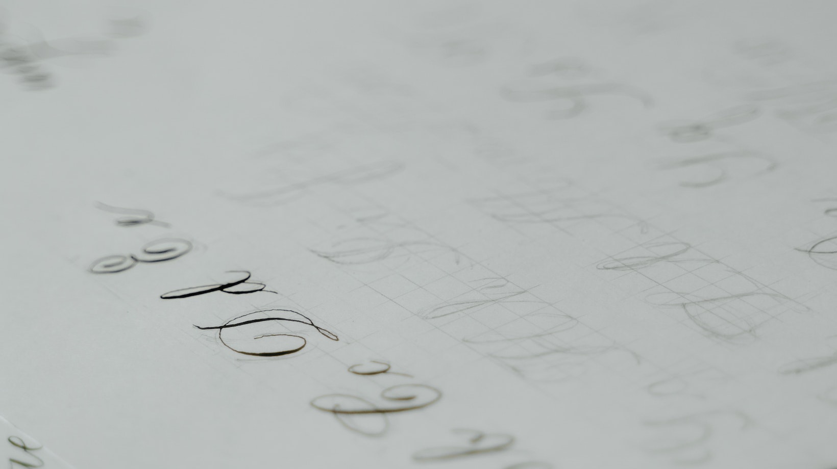
Next, start by sketching out each letter on paper or using a digital tablet. This initial step allows you to experiment with different shapes, sizes, and styles before committing to the final design. Once you’re satisfied with your sketches, scan or import them into Illustrator as a template layer.
Now comes the fun part – tracing! Use Illustrator’s pen tool to meticulously trace over each letter outline on a new layer. Pay attention to details such as curves, angles, and consistent stroke widths. Take advantage of anchor points and bezier handles to achieve precise control over each element of your letters.
By following these steps, you’ll be well on your way to creating an original font in Illustrator that perfectly suits your creative vision.
Table of Contents
ToggleHow to Create a Font in Illustrator
When it comes to creating a font in Illustrator, selecting the right tools is crucial. With the right set of tools, you’ll be able to bring your unique vision to life and craft a font that stands out. So, let’s dive into some key considerations when choosing the tools for this creative endeavor.
- Adobe Illustrator: The first tool you’ll need is Adobe Illustrator itself. Known for its powerful vector editing capabilities, Illustrator provides an extensive range of features that will enable you to create and refine your font with precision. From manipulating anchor points to adjusting curves and strokes, this software offers a wide array of options for designing every aspect of your letters.
- Pen Tool: The pen tool is an indispensable ally when it comes to creating smooth and precise paths in Illustrator. It allows you to control each anchor point, ensuring your letterforms are clean and consistent throughout. Take advantage of its versatility by experimenting with different shapes and line variations to give your font its unique personality.
- Grids and Guides: To maintain consistency within your font design, utilizing grids and guides can be incredibly helpful. These tools assist in aligning elements perfectly, ensuring that each character fits harmoniously with others in terms of size, spacing, and proportions.
- Type Design Resources: While Illustrator provides a solid foundation for font creation, there are additional resources available specifically tailored for type design enthusiasts. These resources can offer valuable insights into typography principles, letterform anatomy, kerning techniques, and much more.
- Inspiration: Lastly but certainly not least important is finding inspiration! Look at existing fonts—both classic ones and contemporary creations—to spark ideas for your own design journey. Analyze their forms, experiment with different styles or eras if needed while staying true to your own creative voice.

Key Factors When Choosing the Right Tools
By carefully considering these key factors when choosing the right tools for creating a font in Illustrator, you’ll set yourself up for success and unlock your font-making potential. Remember, the tools are just the beginning; it’s your creativity and dedication that will bring your font to life. So, let’s dive in and start crafting something truly remarkable! Creating a font in Illustrator may seem like a daunting task, but it all starts with sketching out your font. This is the crucial first step where you get to unleash your creativity and give shape to your typography masterpiece.
To begin, grab a pencil and a sketchbook or any paper that allows you to jot down your ideas freely. Start by brainstorming different letterforms, experimenting with various styles, sizes, and weights. Don’t worry about perfection at this stage; it’s all about exploring possibilities.
When sketching out your font, pay attention to the overall structure of each letter. Consider factors such as ascenders (the parts that go above the x-height), descenders (the parts that go below the baseline), and the spacing between letters. Play around with different proportions until you find a balance that appeals to you.
As you sketch, take note of any unique features or details that will make your font stand out. Maybe there’s an interesting ligature combination or an unconventional stroke placement that adds character. These small nuances can make a big difference in giving your font personality and individuality.
Remember to keep referring back to your initial concept or theme for guidance throughout the sketching process. Whether it’s a sleek modern look or a vintage-inspired design, staying true to your vision will help maintain consistency across all characters.


