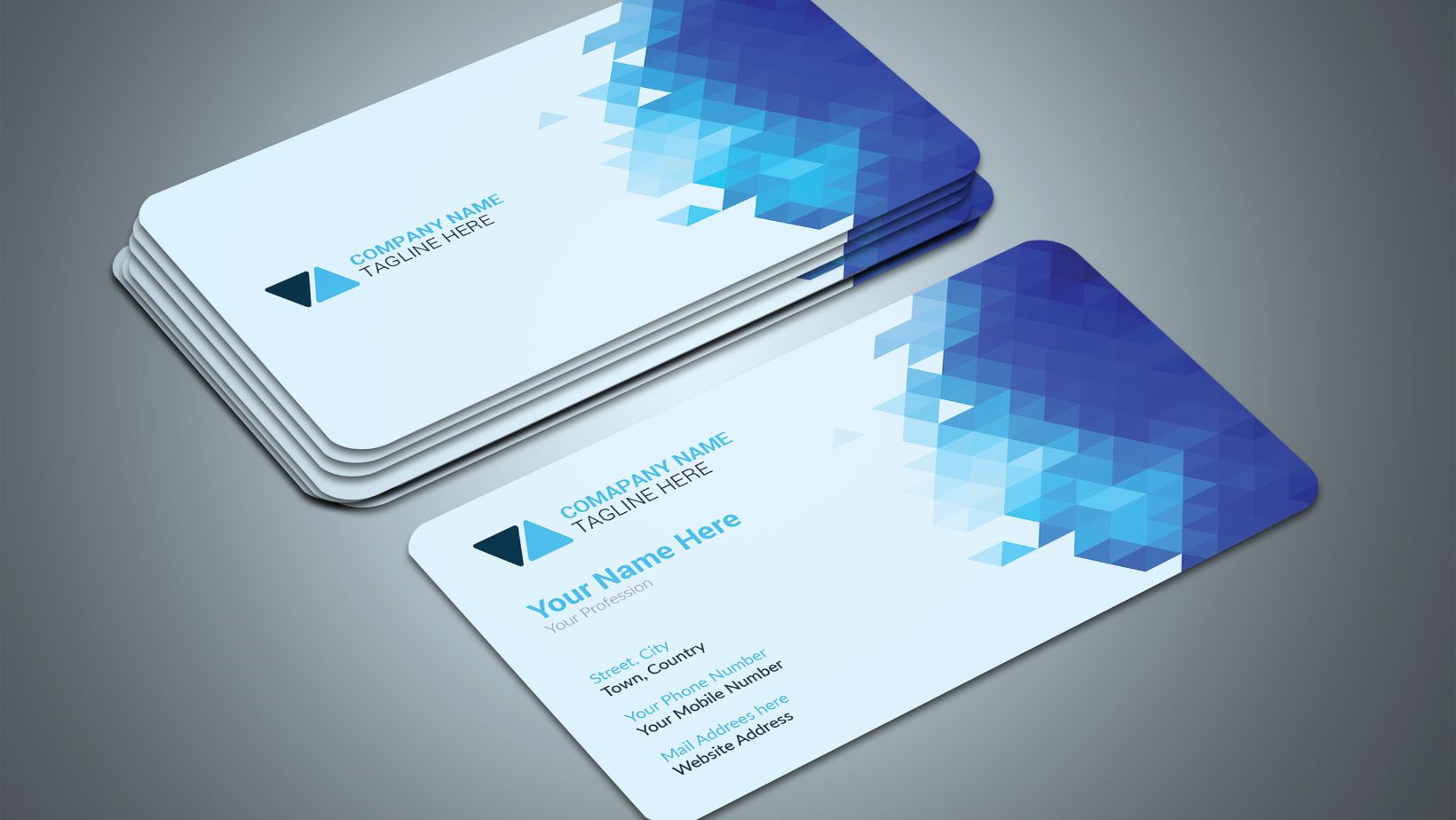
Making business cards in Illustrator can be a simple and effective way to create professional marketing materials. With the right steps, you can design unique and eye-catching cards that reflect your brand identity. In this article, I’ll walk you through the process of creating business cards in Illustrator, from setting up the document to adding your own custom designs.
To start, open Adobe Illustrator and create a new document with the desired dimensions for your business card. Typically, standard business card sizes are 3.5 inches by 2 inches. Set the resolution to at least 300 pixels per inch (ppi) to ensure high-quality printing.
Next, it’s time to unleash your creativity! Use Illustrator’s tools and features to design your business card according to your brand guidelines or personal preferences. You can add text, images, and logos and even experiment with different colors and fonts to make your cards stand out.
Table of Contents
ToggleHow To Make Business Cards in Illustrator
Adding Text to Your Business Card
When it comes to creating business cards in Illustrator, adding text is a crucial step in conveying your brand message effectively. To begin, select the “Text” tool from the toolbar on the left-hand side of the screen. Click anywhere on your canvas to create a text box.
Next, choose a font that aligns with your brand’s aesthetic and values. Consider using a legible yet visually appealing font that reflects professionalism. Experiment with different sizes and styles until you find the perfect combination.
To customize your text further, utilize Illustrator’s tools, such as character spacing, line spacing, and alignment options. These features allow you to achieve optimal readability and visual harmony within your design.
Inserting Images on Your Business Card
Incorporating images into your business card design can help enhance its visual appeal and reinforce your brand identity. To add an image in Illustrator, go to “File” > “Place” or use the shortcut key “Ctrl+D.
Locate the image file you wish to include on your business card and click “Place.” This action will position the image as an editable object within Illustrator.
Once inserted, you may resize or reposition the image by selecting it with the “Selection” tool (shortcut key: V). Simply click and drag any corner handle of the bounding box while holding down the shift to maintain proportions.

Organizing Elements on Your Business Card
When it comes to designing business cards in Illustrator, the arrangement of elements and layout plays a crucial role in creating a visually appealing and effective card. In this section, we’ll explore some key strategies for organizing elements on your business card.
Grouping Related Information
One important aspect of arranging elements is to group related information together. This helps in creating a clear visual hierarchy and makes it easier for recipients to locate specific details quickly. For example, you can consider grouping contact information such as phone numbers, email addresses, and social media handles in one section of the card.
Aligning Elements with Guides
To achieve a balanced and professional look, it’s essential to align your elements using guides in Illustrator. Utilize the alignment tools available to ensure that text boxes, logos, and other graphical elements are properly aligned horizontally and vertically. This will help create a harmonious composition that appears well-organized.
Considering White Space
White space is an often overlooked but powerful design element. It refers to the empty areas between different elements on your business card. By strategically incorporating white space, you can enhance readability and draw attention to key information. Avoid overcrowding your card with too much text or images; instead, embrace the clarity that white space provides.
Experimenting with Different Layouts
Don’t be afraid to experiment with different layouts before settling on one that works best for your brand or industry. Try out variations such as horizontal or vertical orientations, asymmetrical designs, or even unconventional shapes (if appropriate). By exploring different possibilities, you can discover unique arrangements that make your digital business card stand out from the competition.
Remember that each element on your business card should serve a purpose and contribute to its overall effectiveness. Take time to carefully arrange these elements while keeping in mind principles like grouping related information, aligning with guides, utilizing white space effectively, and experimenting with layouts. With a well-organized and visually appealing business card, you can make a lasting impression on potential clients and colleagues alike.


