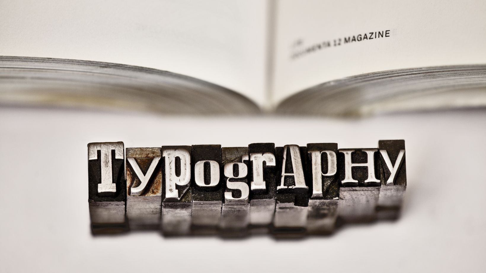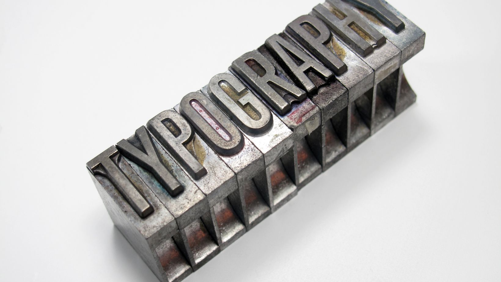
Typography is a critical element in graphic design that significantly influences how a message is perceived. Beyond mere decoration, the careful selection of typefaces can convey emotion, create atmosphere, and greatly enhance communication effectiveness. This article delves into the fundamental role that typography plays in design, exploring how specific typeface choices can impact viewer perception and how they are integral to brand identity. It will provide insights into selecting appropriate fonts, combining typefaces, and adapting typography for various media.
Table of Contents
Toggle- The Psychological Impact of Typeface Choices: How Fonts Influence Perception
- Typography in Brand Identity: Crafting a Memorable Visual Impression
- Choosing the Right Font: Considerations for Readability and Aesthetics
- Combining Typefaces: Tips for Harmonious Integration
- Typography in Digital vs. Print Media: Adapting Strategies for Different Mediums
- Ideal Practices for Beginners: Getting Started with Effective Typography
The Psychological Impact of Typeface Choices: How Fonts Influence Perception
Typography wields a subtle yet powerful influence on how information is received. Each font carries its own psychological weight, with different styles evoking distinct emotions and responses. For example, serif fonts, often used in print, are associated with reliability and tradition, making them excellent choices for formal documents or established companies wishing to convey a sense of authority.
In contrast, sans-serif fonts, with their clean and straightforward appearance, are frequently chosen for their readability on digital screens, lending a modern and approachable feel to websites and online publications. Studies in typography psychology suggest that the emotional response to a font precedes the content’s comprehension, shaping the reader’s attitude toward the information even before it is fully processed. Therefore, understanding these psychological effects is paramount for designers aiming to align a typeface’s emotional impact with the intended message of the content.
Typography in Brand Identity: Crafting a Memorable Visual Impression
A brand’s identity is profoundly influenced by the typefaces it employs. Typography in branding goes beyond mere aesthetic appeal to forge a connection with the audience, encapsulating the brand’s values and personality. Choosing the right typography can set the tone of the brand communication and ensure consistency across all marketing materials. For instance, a luxury brand might opt for elegant, custom fonts that project exclusivity and refinement, while a tech company might use modern, minimalist fonts that reflect innovation and efficiency.

The key is coherence; every typographic element should harmonise to present a unified brand image. Moreover, distinctive typography can enhance brand recognition, making it easier for customers to identify the brand across different contexts. By carefully curating typefaces that reflect a brand’s essence, companies can strengthen their identity and stand out in a competitive market.
Choosing the Right Font: Considerations for Readability and Aesthetics
Selecting the appropriate font is a balance of readability and aesthetic appeal, where each choice can significantly affect the clarity and impact of your design. Readability is paramount, particularly when dealing with essential documents or web content that users need to engage with efficiently. For example, converting PDF to Word documents often requires a clear, readable font to ensure that the information is as accessible as possible when edited or reformatted. This is because the inherent characteristics of a font, such as size, letter spacing, and x-height, affect how easily text can be read.
Aesthetically, the font should align with the overall design vision, enhancing the content without overwhelming it. For instance, a whimsically styled font might be perfect for a children’s book cover but inappropriate for a business report. The choice of font should reflect the context and purpose of the text, enhancing both the usability and the visual harmony of the document.
Combining Typefaces: Tips for Harmonious Integration
Integrating multiple typefaces is an art that can elevate the sophistication of any design project, yet it requires a delicate balance to avoid visual clutter. The key to successful combination lies in finding complementary contrasts. Start with choosing typefaces that share a similar mood or theme yet differ enough to create a distinct hierarchy and interest. For example, pairing a robust serif with a light sans-serif can provide both contrast and cohesion, where one is used for headings and the other for body text.
It’s also effective to mix fonts from the same family but different weights or styles, such as a regular font for body text and its italic or bold variant for emphasis. When combining typefaces, it’s crucial to maintain consistency in x-height and proportion to ensure the text remains harmonious across the design. Limiting the number of typefaces to two or three is advisable to maintain a clean and organised appearance. With careful selection and thoughtful application, combining typefaces can enhance the visual depth and readability of your design.
Typography in Digital vs. Print Media: Adapting Strategies for Different Mediums
The approach to typography differs significantly between digital and print media, each with its own set of challenges and considerations. In print, the legibility of a font can greatly depend on the type of paper and the quality of the print itself. Factors such as ink spread and the absorbency of the paper can affect how a typeface appears, so choosing fonts that are resilient to these physical factors is crucial.
Conversely, digital media offers dynamic capabilities such as adjustable size and resolution settings, but it also introduces variables like screen glare and varying device displays, which can impact readability. Here, designers often prefer sans-serif fonts because they remain readable at smaller sizes and on lower-resolution screens. Additionally, digital typography must accommodate interactive elements like links and buttons, which necessitates an easy-to-read design that enhances user navigation. Adapting typography strategies to suit the medium ensures that whether the content is accessed on a glossy brochure or a mobile phone, the text is always clear and effective.
Ideal Practices for Beginners: Getting Started with Effective Typography
Mastering typography can be daunting for those new to graphic design, yet understanding some foundational best practices can streamline the learning process. First, it is vital to grasp the basics of font classification and how different types of typefaces — serif, sans-serif, script, and display — can be used effectively in various contexts. Beginners should start by experimenting with these types in simple projects to see how they influence the design’s feel and readability.

Another important practice is to learn about kerning, leading, and tracking, which are adjustments that affect the spacing between characters, lines, and blocks of text. Proper manipulation of these aspects can drastically improve the legibility and professional appearance of a layout. Additionally, it is beneficial to utilise typography tools and software, which can help designers experiment more freely and see instant results. By building a solid foundation in these areas, beginners can start to develop a keen eye for typography and gradually incorporate more complex techniques into their designs.


