 In graphic design, color accuracy is essential for producing high-quality prints that match the original digital design. Whether creating marketing materials, packaging, or large-format prints, precise color representation affects brand consistency, consumer perception, and professional credibility. Without proper color management, discrepancies between on-screen colors and printed results can lead to costly reprints and brand misrepresentation.
The Role of Color Accuracy in Professional Printing
Color accuracy ensures that printed materials maintain consistency across various mediums. Designers and print professionals rely on calibrated monitors, standardized color profiles, and high-quality printing equipment to achieve precise color reproduction.
Many businesses invest in commercial office printers with advanced color management features to maintain consistent colors across different print jobs. These printers are equipped with sophisticated software that helps bridge the gap between digital designs and physical prints. Without these technologies, businesses risk producing materials that do not align with their brand’s established color standards.
Factors Affecting Color Accuracy in Printing
Several factors influence the accuracy of colors in printed materials:
1. Color Profiles and Standards
Digital and print mediums use different color models, which affects how colors are displayed and reproduced. Computer monitors and digital displays operate in the RGB (Red, Green, Blue) color space, which is optimized for light-based color mixing. In contrast, printers use the CMYK (Cyan, Magenta, Yellow, and Black) color model, which blends ink pigments to produce a full spectrum of colors.
Without proper conversion, colors that appear vibrant on a screen may print differently. Industry-standard ICC (International Color Consortium) profiles help regulate these conversions, allowing colors to stay consistent across various devices and print formats. Designers and print professionals use these profiles to calibrate their software, preventing unexpected shifts in hue or saturation.
2. Monitor Calibration
A miscalibrated monitor can lead to incorrect color representation, making it difficult for designers to predict how their work will appear in print. Most standard monitors are designed for general use, which means they may not display colors with high accuracy.
Professional graphic designers and print specialists use hardware calibration tools to adjust brightness, contrast, and color balance for their design projects to match industry standards. Regular calibration—typically done using a colorimeter or spectrophotometer—helps maintain accurate color representation on screen, aligning it as closely as possible with the final printed output.
3. Paper Type and Finish
The choice of paper significantly influences color perception and ink absorption. Different paper stocks produce varying levels of contrast, sharpness, and vibrancy:
- Glossy Paper: Enhances color intensity, making images appear more vivid and saturated. Commonly used for high-quality photography and marketing materials.
- Matte Paper: Produces softer, muted tones and is preferred for professional documents, business cards, fine art prints, and understated designs.
- Textured or Specialty Paper: Absorbs ink differently, sometimes causing slight color shifts or reducing sharpness, depending on the surface characteristics.
Additionally, coated vs. uncoated paper affects how ink sits on the surface. Coated papers have a smoother finish, preventing ink from spreading and maintaining fine details, whereas uncoated papers allow more ink absorption, which can slightly dull the appearance of the finished product.
4. Printer Settings and Ink Quality
Even the most well-designed digital artwork can lose accuracy if the printer’s settings are not configured correctly. Color mode settings, print resolution, and ink type all contribute to how colors appear on the final output.
- Ink Quality: Higher-grade inks contain pigments that are formulated for better color fidelity and longevity. Inexpensive or low-quality inks may produce faded or inaccurate hues.
- Printer Calibration: Adjusting printer settings for specific paper types and ink combinations prevents oversaturation or dull color reproduction. Many professional printers have built-in calibration features to optimize output.
- Print Resolution: Higher resolutions (measured in DPI or dots per inch) enhance color precision by printing finer details. Lower DPI settings can cause pixelation and inaccurate color blending.
A well-managed printing process requires attention to multiple variables, from monitor calibration to paper selection and printer settings.
Consequences of Poor Color Accuracy
Inconsistent color reproduction can negatively affect a brand’s image and lead to financial losses. Businesses that depend on print materials—such as marketing agencies, product packaging firms, and advertising companies—must ensure their prints align with their brand’s identity.
Some common issues caused by poor color accuracy include:
- Mismatched branding elements across different materials
- Increased costs due to reprints and corrections
- Loss of trust from clients and consumers
Inconsistent color accuracy can do more than just disrupt a brand’s visual identity—it can undermine credibility and weaken customer trust. When colors fail to match expectations, businesses may face expensive reprints, production delays, and misaligned marketing efforts. These setbacks affect budgets and create frustration for clients and stakeholders.
Great Practices for Maintaining Color Accuracy
To achieve reliable color accuracy in graphic design printing, professionals follow these best practices:
1. Use a Standardized Workflow
Establishing a consistent workflow that includes color calibration, soft proofing, and test printing helps minimize color discrepancies.
2. Invest in High-Quality Printing Equipment
Using professional-grade printers and inks designed for color precision enhances print quality. Regular maintenance and calibration of printing devices also contribute to consistent results.
3. Work with Professional Print Services
Partnering with printing professionals who understand color management helps achieve accurate prints for digital marketing. Many print service providers use advanced technology to maintain consistency across large production runs.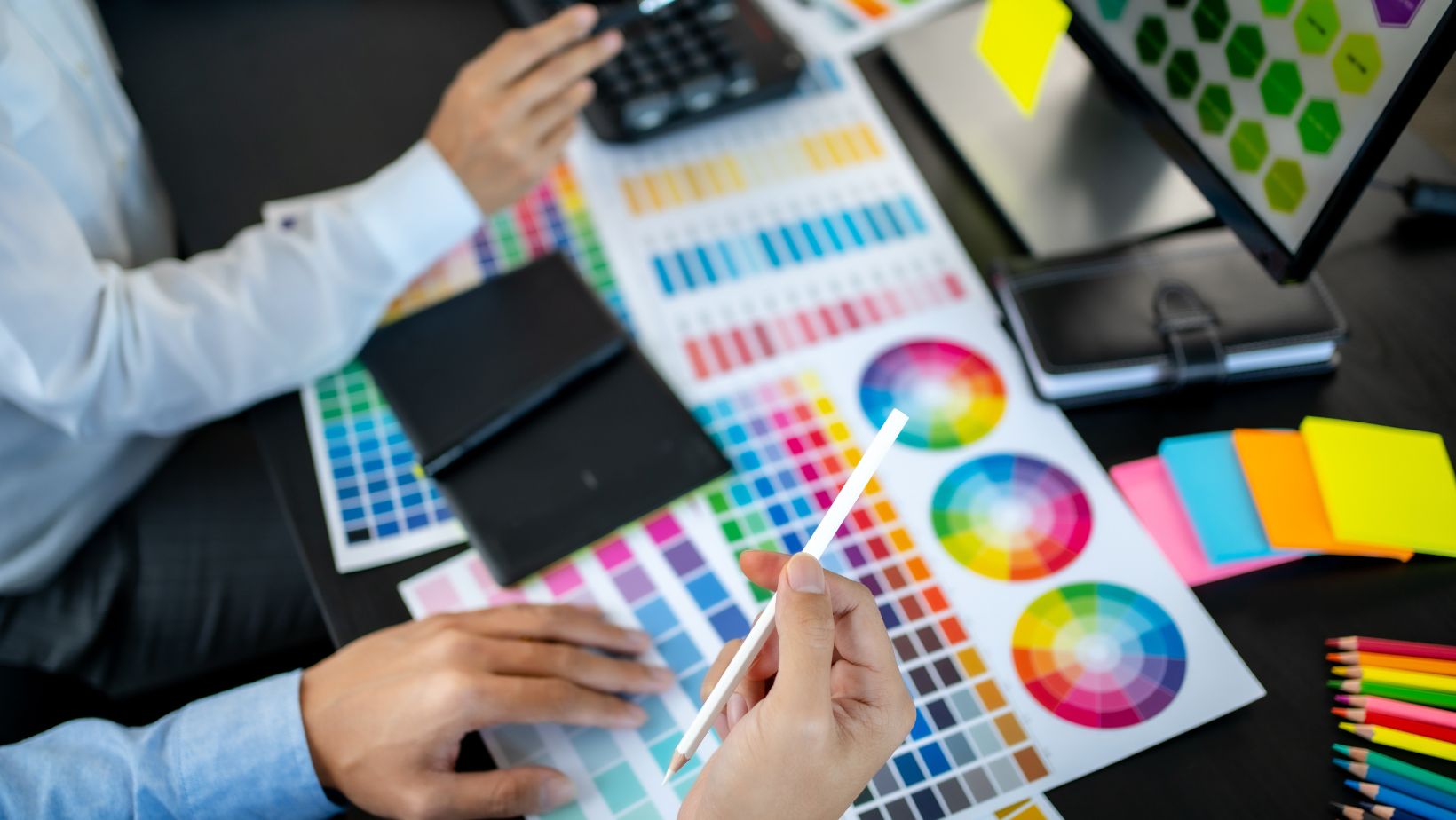
Implementing these practices helps maintain consistent color reproduction, reducing errors and minimizing reprints. A structured approach to color management supports efficiency, enhances print quality, and ensures that final outputs align with design expectations.
Conclusion
Color accuracy plays a critical role in graphic design printing, impacting brand identity, professional credibility, and overall visual appeal. By utilizing proper calibration techniques, selecting high-quality printing equipment, and adhering to standardized color profiles, designers and businesses can achieve consistent and precise print results. Prioritizing color accuracy minimizes costly errors and allows printed materials to accurately reflect the intended design.