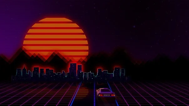
In this Retro Graphic Design Guide, you’ll gain access to an entertaining, one-of-a-kind experience. You’ll be taken on a journey through the history of graphic design. From serifs to grids and even a seasoning or two as well as some slices of life in between – naturally!
In the early days of graphic design, there were no computers or software programs. Everything was done by hand, with pencils, brushes, and ink. This made for some very creative and unique designs!
One of the most popular styles back then was retro design. This involved using bold colors and fonts, as well as vintage images and patterns. Retro design is still popular today, and many brands use it to give their products a classic feel.
If you want to try your hand at retro design, here are a few tips to get you started:
1) Use bright colors – these will help your designs stand out from the crowd.
2) Choose classic fonts – old-fashioned fonts like serifs.
Table of Contents
Toggle- Following is The Outline To Better Understand the History Of Retro Graphic Design
- What Is A Retro Graphic Design And How Did It Come About?
- What Are The Most Popular Elements Of Retro Graphic Design And Why Are They So Appealing To People Today?
- How Can You Create A Retro Feel In Your Own Designs, Even If You’re Not Using Traditional Retro Elements Like Clip Art And Fonts?
- Varying your design style to achieve the desired feel is an essential skill for any designer. Create that classic, vintage look with simple yet effective techniques like heavy filters or halos around light sources–or go all out by using bright colors and washed-out tones in order to create this perfect retro vibe!
- If you’re looking for a fresh take on the traditional design aesthetic, then this is just what your next project needs. With techniques like incorporating textures and patterns that evoke midcentury styles into every aspect of our work, we create an extra layer or two in tribute to those old-fashioned yet fascinating designs!
- Are There Any Drawbacks To Using Retro Graphics In Your Designs, Or Are There Potential Problems With Overusing Them Too Much?
- How Do You Think Retro Graphic Design Will Continue To Evolve In The Future, And What Trends Do You See Emerging In That Area?
- Conclusion About Retro Graphic Design Guide
- In the coming year, marketers will have a chance to cash in on this retro trend by using vibrant colors with simple fonts. To achieve an authentic look for your brand you should experiment with borders and patterns while staying true overall theme of simplicity in design – pastel-hued pieces paired together beautifully!
- What Are The Most Popular Elements Of Retro Graphic Design And Why Are They So Appealing To People Today?
- What Is A Retro Graphic Design And How Did It Come About?
Following is The Outline To Better Understand the History Of Retro Graphic Design

What Is A Retro Graphic Design And How Did It Come About?
Retro graphic designs have been around for a long time, and there’s no end in sight! From the 1800s all the way up until modern-day–retro graphics are always fashionable. This style can take many different forms depending on what period you want to emulate:
If it’s the late Victorian era then your design might include detailed insane ladies wearing towering fripperies while holding court with other historical figures from times gone by; maybe instead try go indicators or zodiac symbols? The possibilities really do seem endless when designers get creative about exploring this rich history that has provided us so much inspiration today.
What Are The Most Popular Elements Of Retro Graphic Design And Why Are They So Appealing To People Today?
Popular design elements include:
-Drawings of people with exaggerated features (such as large eyes or feet)
-Bright colors
-Bold patterns
-Serif fonts
-Shapes like stars, hearts, bubbles, and arrows
The elements of retro graphic design have become extremely popular over the past several years. From bold colors and simple typography to intricate illustrations and geometric shapes, these elements have a nostalgic and timeless appeal that allows them to remain relevant in modern design while still evoking feelings of nostalgia and retro style.
When you want to take your design in a totally new direction, using elements of retro graphic design is exactly what’s needed! This includes fun colors that speak directly through the human senses. Typefaces with intentional imperfections add even more personality; these vintage-inspired patterns cannot help but entertain anyone who sees them too!
https://www.designwizard.com/blog/design-trends/retro-design
How Can You Create A Retro Feel In Your Own Designs, Even If You’re Not Using Traditional Retro Elements Like Clip Art And Fonts?
Varying your design style to achieve the desired feel is an essential skill for any designer. Create that classic, vintage look with simple yet effective techniques like heavy filters or halos around light sources–or go all out by using bright colors and washed-out tones in order to create this perfect retro vibe!
If you’re looking for a fresh take on the traditional design aesthetic, then this is just what your next project needs. With techniques like incorporating textures and patterns that evoke midcentury styles into every aspect of our work, we create an extra layer or two in tribute to those old-fashioned yet fascinating designs!
Are There Any Drawbacks To Using Retro Graphics In Your Designs, Or Are There Potential Problems With Overusing Them Too Much?
I don’t think there are any drawbacks to using retro graphics in your designs. I think that the only potential problem with overusing them is that it might lead to a sort of “theme park effect,” where everything seems like an imitation of the thing it’s imitating rather than a real, functional, and useful product.
https://www.pinterest.com/wardyfai/retro-design/

How Do You Think Retro Graphic Design Will Continue To Evolve In The Future, And What Trends Do You See Emerging In That Area?
While there is certainly a place for theme park-like effects (in theme parks), I don’t think you want to make every piece of your design look like it’s out of a time capsule. Even if you’re going back to simpler designs and simpler patterns, remember that they have to still function in the world you live in now.
Conclusion About Retro Graphic Design Guide
Have you ever tried to create retro-style graphics but ended up? It wasn’t easy for me too. My initial reaction when asked if I could do it was a resounding and complex “NO!!!”
I’ve started digging into information, checked books on grandfather’s paintings (a painter), asked some friends who are designers with this style of prints -and…hmm how shall I put things simply?! After all these activities, I learned that it’s actually cool !!!! And many professionals manage very nicely done vintage looks.
In the coming year, marketers will have a chance to cash in on this retro trend by using vibrant colors with simple fonts. To achieve an authentic look for your brand you should experiment with borders and patterns while staying true overall theme of simplicity in design – pastel-hued pieces paired together beautifully!
The retro graphic design style has been gaining popularity in recent years. The vintage elements of this type, such as fonts and colors are paired with modern principles to create eye-catching graphics that engage the audience’s senses – sight (what they see) and soundly hear! To perfect your skills you’ll need basic training on how these work so let’s get started right away!.
Whether you’re creating a company website or designing a promotional poster, retro graphic design can help add a fun and nostalgic touch to your work. So if you’re looking to take your designs to the next level, why not give retro graphic design a try? You’ll be sure to get hooked on this enticing trend!
We hope you’ve enjoyed this little delve into retro graphic design. It’s a great way to add some personality and distinction to your work, whether you’re just starting out or an experienced pro! If want to learn more about how to create awesome designs in the style of old-school posters? Be sure to check out all these resources we listed earlier – they will show even beginners like me exactly what is possible with modern technology tools such as Photoshop CS5+. And don’t forget to share them on social media too–we love seeing other people’s successes!!


