
A logo is one of the most powerful tools for establishing your restaurant’s identity. It’s the first thing customers notice and the element they’ll remember long after their visit. A well-designed logo communicates your restaurant’s personality, sets the tone for your dining experience, and helps you stand out in a crowded market. In this guide, we’ll walk you through the essential steps to create a logo that perfectly represents your restaurant.
This article was prepared by the experts at Turbologo, a company that specializes in helping businesses design logos that captivate audiences and elevate brands.
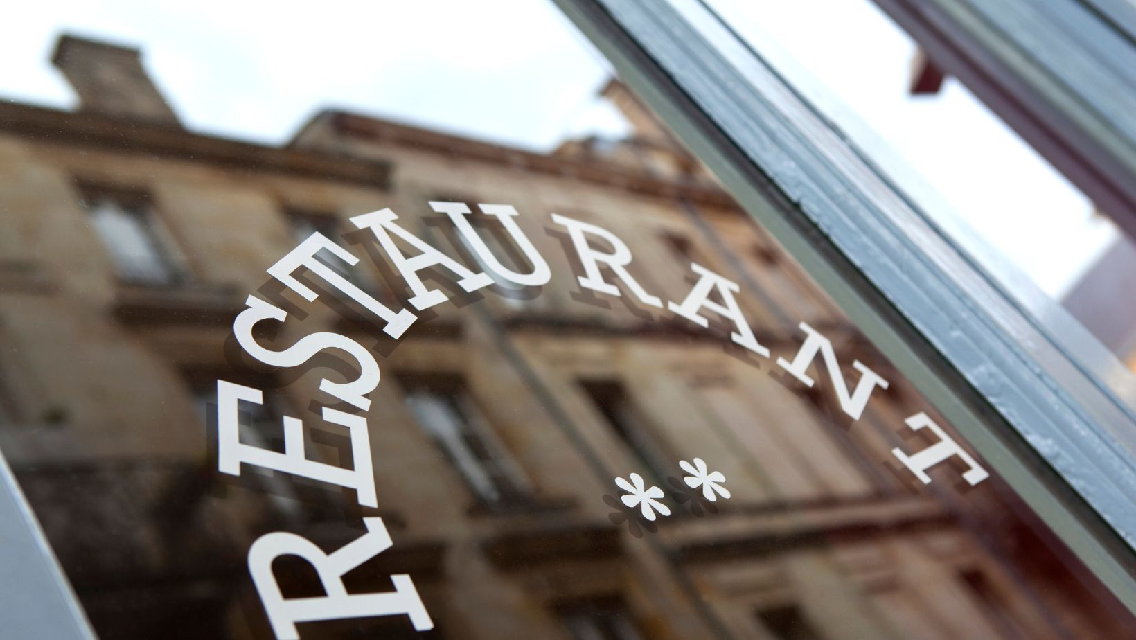
Why Your Restaurant Needs a Memorable Logo
Your restaurant’s logo is more than just a design—it’s the face of your brand. Whether it’s displayed on a menu, a storefront, or social media, your logo serves as a visual representation of what your restaurant stands for. A memorable logo builds trust, attracts attention, and creates a connection with customers.
In the competitive food industry, a strong logo helps differentiate your restaurant from others. It’s your chance to tell a story, evoke emotion, and create a lasting impression, making your restaurant the go-to choice for diners.
Defining Your Restaurant’s Brand Identity
Before you start designing your logo, it’s important to define your restaurant’s brand identity. Ask yourself:
- What type of food do you serve?
- What atmosphere do you want to create—casual, elegant, or adventurous?
- Who is your target audience?
Your answers will shape the tone and style of your logo. For example, a family-friendly pizzeria might benefit from a playful, colorful design, while a high-end sushi bar might require a sleek, minimalist look. Understanding your brand identity ensures that your logo aligns with your restaurant’s overall image.
Simplify Branding with Free AI for Logo Design
Defining your restaurant’s brand identity is the first step to creating a memorable logo, and tools like a logo creator can make this process faster and easier. These platforms allow you to experiment with different styles, colors, and symbols that align with your restaurant’s personality. Whether you want a modern minimalist design or something bold and playful, AI-powered tools can generate customized logo ideas in minutes.
With intuitive interfaces and instant previews, these tools take the guesswork out of design, helping you focus on perfecting the look and feel of your logo. Best of all, they’re accessible to anyone, regardless of experience, making professional branding achievable for every restaurant owner.
Choosing the Right Colors to Tempt Customers
Colors play a critical role in restaurant logos because they evoke emotions and influence appetite. Warm colors like red, orange, and yellow are known to stimulate hunger, which is why they’re common in food branding.

At the same time, your color palette should reflect your restaurant’s cuisine and vibe. A French bistro might use soft pastels for elegance, while a barbecue joint might opt for earthy tones like brown and red to convey warmth and bold flavors.
The key is to strike a balance between colors that appeal to your audience and those that set the right mood for your restaurant.
Fonts That Speak Your Style: From Casual to Fine Dining
Typography is another crucial element of your restaurant logo. The font you choose should reflect the character of your restaurant while remaining legible across different mediums.
For example:
- A rustic diner might use handwritten or vintage-style fonts to create a nostalgic feel.
- A modern café could opt for clean, sans-serif typography to convey simplicity and freshness.
- A fine-dining establishment might prefer elegant serif fonts that exude sophistication.
The font should complement your logo’s overall design, ensuring a cohesive and polished look.
Incorporating Food and Culture into Your Design
Your logo should capture the essence of your cuisine and the cultural influences behind it. Incorporating food-related symbols, such as a pizza slice, sushi roll, or steaming bowl of noodles, can make your logo instantly recognizable.
Additionally, cultural elements can help highlight the authenticity of your restaurant. For example, using traditional patterns, motifs, or iconography tied to your cuisine’s origins adds depth and meaning to your design. These elements create a connection with your audience, emphasizing the uniqueness of your offerings.
The Power of Icons: Using Visuals That Represent Your Cuisine
Icons are a great way to communicate your restaurant’s concept quickly and effectively. A well-chosen icon can convey what type of food you serve and the experience customers can expect.
For instance:
- A taco silhouette immediately signals a Mexican theme.
- A wine glass and fork suggest a fine-dining atmosphere.
- Flames or grills evoke bold, smoky flavors for a barbecue restaurant.
Icons simplify your message and make your logo more memorable, especially when paired with complementary typography and colors.
How to Balance Creativity and Clarity
While creativity is important, it’s equally crucial to maintain clarity in your logo design. Overly complex logos can confuse customers or lose their impact when scaled down.
Focus on simplicity and avoid clutter. Your logo should be instantly recognizable at a glance, whether it’s on a business card or a billboard. A clean, well-organized design will always be more effective than one that tries to do too much.
Adapting Your Logo for Menus, Signs, and Digital Platforms
A restaurant logo needs to be versatile enough to work across various formats. It should look just as appealing on a menu or storefront sign as it does on social media or a website.
To achieve this, ensure your logo is:
- Scalable: It should retain its quality and readability at any size.
- Flexible: The design should work in both color and black-and-white formats.
- Responsive: Consider creating variations of your logo for different platforms, such as a simplified icon for social media profiles.
Adaptability ensures that your logo remains consistent and professional, no matter where it’s displayed.
Common Mistakes to Avoid in Restaurant Logo Design
Many restaurant owners make mistakes when designing their logos, such as:
- Using overly trendy designs that may feel outdated in a few years.
- Choosing fonts or colors that don’t match their brand identity.
- Creating overly detailed logos that don’t scale well.
By focusing on timeless, brand-specific elements, you can avoid these pitfalls and create a logo that lasts.
Making Your Logo Stand Out in a Competitive Market
The food industry is highly competitive, so your logo needs to grab attention and make a lasting impression. Think about what sets your restaurant apart—is it your unique menu, your warm ambiance, or your cultural authenticity? Highlight these qualities in your logo to ensure it reflects your distinct personality.
At Turbologo, we help restaurants design logos that stand out from the crowd. With our intuitive tools and expert insights, you can create a logo that captures the heart of your brand and resonates with your audience.
Your logo is the cornerstone of your restaurant’s identity—make it a design that leaves your customers hungry for more.