Fonts are a mainstay of graphic design and one of the most important choices a designer makes in a project. Choosing the right one is essential in evoking a certain feel or emotion.
When deciding on the Stranger Things font, the Duffer Brothers went with the classic ITC Benguiat font for a good reason, Steven King.
Stranger Things is in the sci-fi horror genre, and the creators wanted a font to match the genre. What better place to find inspiration than Steven King’s book covers? Can you say horror feels? Steven King evidently agrees.
In addition to the official Stranger Things font, we set out to find eight more serif typefaces that are comparable in look and feel in case you need a little variety. Travel to the Upside Down is not required.
1. The Official Stranger Things Font: ITC Benguiat
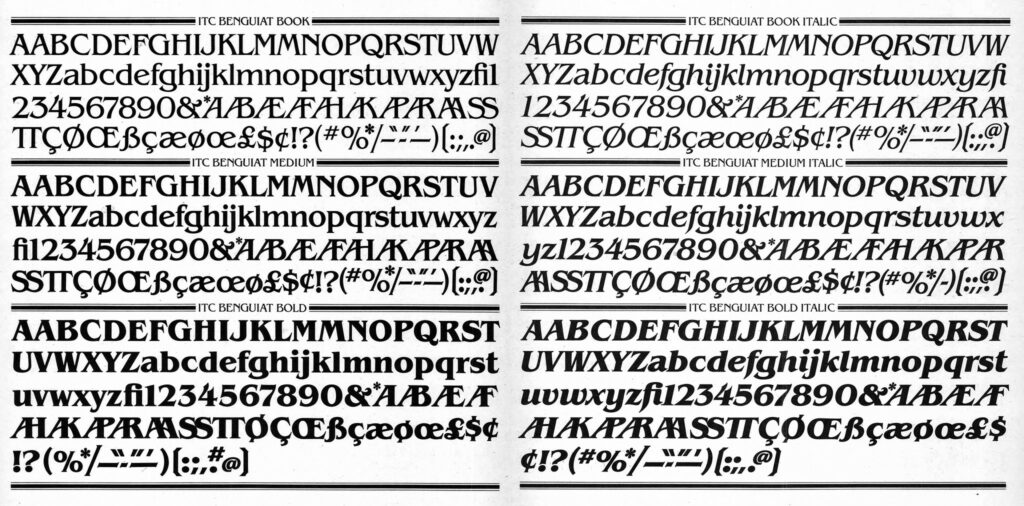
Contend designed the Stranger Things logo based on the initial ideas from the Duffer brothers. For it, they used the ITC (International Typeface Corporation) Benguiat font designed by Ed Benguiat in the 1970s.
In an interview with Vulture, Ross Duffer told the magazine, “There was a two-fold inspiration. One was, in terms of the font and the title design, going back to those old vintage Stephen King books…
Benguiat’s signature font is a serif type often used for logos and branding that want that 80s feel. This Stranger Things font gives the feel of eerie meets Art Nouveau.
The Duffer brothers haven’t strayed from authentic 80’s elements in Stranger Things. This font follows suit.
As far as design goes, with its extreme x-height, this font stands out and tickles the imagination, especially with a glow effect added to it. It was an excellent font to set the tone for the show beginning at the opening screen.
ITC Benguiat often gets paired with the ITC Avant Garde Gothic font. They work perfectly together. So perfect that the names of the cast in the opening credits appear using a bold version of Avant Garde Gothic.
Other Famous Uses of the ITC Benguiat Font
Over the years, ITC Benguiat got used often in a variety of different ways. Some may surprise you! Here are just a few:
- Steven King Novels
- RCA Records House Font in the ’80s
- Choose Your Own Adventure Covers
- Quentin Tarantino’s Logo in His Films
- The Handmaid’s Tale Book Cover
- Doctor Strange Movie Logo (2022)
Where to get the Stranger Things font ITC Benguiat: Adobe includes ITC Benguiat in
Adobe Fonts. If you have an Adobe subscription, it’s already available to you. You can also download a free version from the FreeFonts website.
2. The Popular ITC Korinna Font
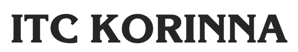
Ed Benguiat and Victor Caruso also designed the Korinna font for the International Typeface Corporation. Korinna comes from the original typeface created by H. Berthold in 1904. It was common practice to redraw old hand-cut fonts and release them for type in the 1970s era.
You may have seen the Korinna font out in the wild in places like:
- Clues in the game Jeopardy in 1984
- Capcom logo’s
- Titles and headings on Advanced Dungeons and Dragons books
- Good Morning America (1986-1988)
- Mork and Mindy
- Walt Disney packaging
Where to get the ITC Korinna font: Download a free version at Fonts Geek for personal use. The commercial version is available on Fonts.com.
3. The Flexible Mandrel Font
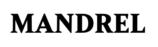
Designed by Jeremy Dooley, the Mandrel font is stately and impactful. It looks steady and bold with its chunky feet. There are 52 styles in this serif typeface. Mandrel also comes as an OpenType font.
OpenType is a font format that includes many variables for creating the perfect typeface for your project. Mandrel is an OpenType font that takes advantage of these variables, making it an excellent choice for any design work. Mandrel includes all of the characters you need to create stunning designs similar to the Stranger Things logo.
Where to get the Mandrel font: Mandrel is also included in Adobe Fonts. If you have an Adobe subscription, it’s already available to you. You’ll also find a free personal use version over on All Free Fonts.
4. The Aviano Font
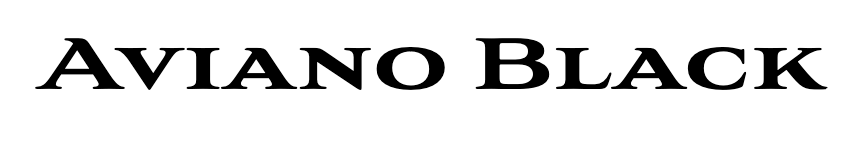
Aviano is another font from designer Jeremy Dooley. This grand font looks stenciled and sturdy. Fun fact, Aviano got its name from a small town in northern Italy located at the base of a mountain.
Where to get the Aviano font: Aviano is also available through Adobe Fonts. Otherwise, get a free personal use version at Fonts Geek.
5. A Real Look Alike: The MGB Patrician Font
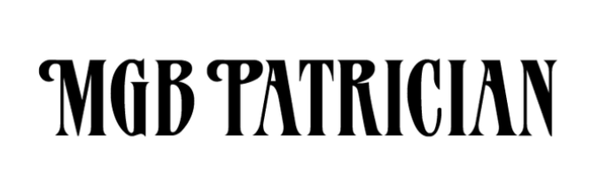
MGB Patrician looks a lot like the Stranger Things font ITC Benguiat. Designed by Don Munson from Ballantine Books, it got released in the 1980s as well.
You can see an example of the two paired together on the cover of the book, “Sister Outsider” by Audre Lorde.
Where to get the MGB Patrician font: Fonts Addict has a free download available for personal use.
6. The German Moulin Rouge Font
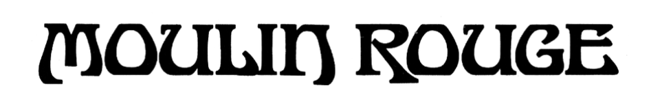
Moulin Rouge is a fanciful gothic-style font face. The numbers and symbols look just as good as the letters. This Art Nouveau typeface came from an old shop near Munich, Germany, with no official designer on record.
Using this font will bring the whimsical history of the original to your designs.
Where to get the Moulin Rouge font: Get a free download of Moulin Rouge at DaFont.
7. The Classic Windsor Font
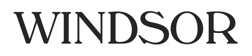
In 1905, Eleisha Pechey designed the Windsor font. Afterward, Stephenson Blake cut it by hand to use in the printing process.
Its popularity peaked in the 1970s, and it carries a sense of that decade along with every design.
Where to get the Windsor font: Get a free personal use download of Windsor Regular at the Fonts Geek website.
8. The ITC Caxton Font
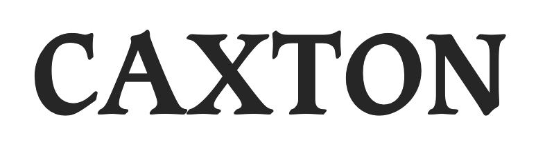
Designed in 1981 by Leslie Usherwood, Caxton is another ITC font. Like ITC Benguiat, it also has a very large x-height making it a perfect Stranger Things font.
Its name came from a fifteenth-century English printer, William Caxton. William Caxton learned the printing process after his eyesight started going bad and copying manuscripts became tedious. He printed over 70 books by hand over his 14-year career as a printer.
Where to get the ITC Caxton font: Download the Caxton font at Cufon Fonts or buy a commercial license at My Fonts.
9. The Variable ITC Souvenir Font
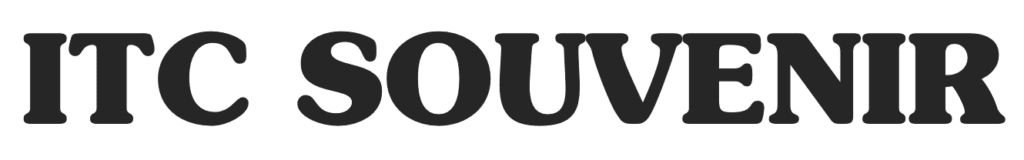
Souvenir was the first typeface released by ITC in 1972. It was a revival design from Ed Benguiat of a font created initially by Morris F. Benton in 1914. It’s a rounded serif typeface heavily used in the 1970s.
It comes in both TrueType and OpenType formats, making it compatible with a wide range of software applications.
Where to get the ITC Souvenir font: Download a free personal use version of the ITC Souvenir font over at DaFont Family.
Wrapping it Up
The classic Stranger Things font style is Art Nouveau with an extra-large x-height. It’s a great font style for titles and headings in posters, books, and films, especially for nostalgic 1980s-style designs.
No matter what font you choose, you’ll have to do some creative design to get the same interlocking style as the Stranger Things title and logo. This isn’t standard out of the box. To do this, make the first and last letters larger and raise the center text up.
What are you waiting for? Go download your favorite fonts and start designing!